

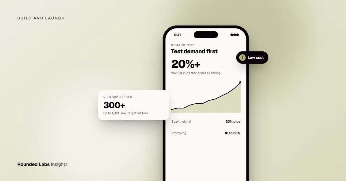
To test demand with a landing page, publish one page that explains a single promise, send 300 to 1,000 targeted visitors to it, and measure how many leave an email address, book a call or pay a small deposit. As a rough guide, 20% or more of well-targeted visitors joining a waitlist is strong, 10 to 20% is promising and under 5% means rethink the message or the audience. A test like this typically costs a few hundred pounds, not tens of thousands.
We build apps for a living, and some of the most useful work happens before any code exists. At Dabbl, a trading app for first-time investors, the central question was whether newcomers wanted a simpler way in, which is exactly the kind of question a cheap test answers first. This guide covers how to frame a hypothesis, what to put on the page, where to find visitors, which numbers to trust and what to do with the result. All costs and benchmarks here are market estimates and rules of thumb, not quotes or guarantees. If you want help turning findings into a plan, see our services.
Key facts
- A landing page tests interest in a promise, not the quality of a finished product.
- Email sign-ups are a weak signal, a booked call is stronger and a deposit or pre-order is stronger still.
- Plan for 300 to 1,000 visitors from your real target audience, otherwise the percentages mean little.
- A typical test costs £200 to £1,500 in ads and tools and takes two to four weeks (market estimate).
- Decide your pass mark before you launch, so the result cannot be talked into a pass afterwards.
- Collecting email addresses in the UK or EU means following UK GDPR or GDPR, so ask for clear consent and say what you will send.
- A positive result tells you to go deeper, it does not replace talking to users.
What is a landing page demand test?
It is a single web page that describes a product that does not exist yet, as if it were nearly ready, with one clear action for the visitor: join the waitlist, book a demo, or put down a deposit. You then count how many people take that action out of everyone who sees the page.
The test answers one narrow question: when a stranger in your target audience reads this promise, do they care enough to act? It does not tell you whether your app will be easy to use, whether people will keep using it, or whether the economics work. For those questions, see How to validate an app idea before you spend £50k and How to run user interviews before building. Think of the landing page as the first of several cheap filters, each one removing a different kind of risk before you commit real money.
Founders sometimes call this a “smoke test” or a “fake door test”. The names matter less than the discipline. A good test has a written hypothesis, a defined audience, a fixed budget and a pass mark agreed in advance. A poor test is a pretty page left online for a month while the founder watches the sign-up counter and hopes.
What a demand test can and cannot tell you
| Question | Can a landing page answer it? | Better tool |
|---|---|---|
| Does this audience respond to this promise? | Yes | Landing page |
| Which of two messages lands better? | Yes, with enough traffic | Landing page A/B test |
| What price will people accept? | Partly, through deposits | Pricing interviews, paid pilots |
| Will people keep using it after week one? | No | Prototype, beta, retention data |
| Is the app easy to use? | No | Usability testing |
| Can we build it for the budget? | No | Discovery and technical scoping |
| Is the market big enough? | Only a hint | Desk research, sales conversations |
Keeping this table in mind prevents the most common misuse of the method, which is treating a good sign-up rate as proof of everything.
When is a landing page test the right tool?
A landing page test works best when the idea can be explained in a headline and a few sentences, when you can name where your audience spends time online, and when there is a clear action that signals real interest. It works less well when the product is hard to describe without a demo, when the audience is small and hard to reach by advertising, or when the buying decision involves a long sales process.
| Type of idea | Fit for a landing page test | Notes |
|---|---|---|
| Consumer app with a clear everyday problem | Strong | Ads reach people directly, deposits or waitlists work |
| Small business tool | Strong | Search ads on a specific problem work well |
| Enterprise software | Medium | Use booked calls or letters of intent, not sign-ups |
| Marketplace | Medium | Test each side separately, buyers and sellers need different pages |
| Regulated product such as lending or health | Medium | Be careful with claims, see the section on honesty below |
| Hardware or device-linked app | Medium | Pre-orders are possible but delivery promises are risky |
| Entertainment or social app | Weak | Interest is easy to get and says little about habit |
For a marketplace, you are testing two audiences with two promises, so plan two pages and two small budgets. If your idea is a small business app, a single page aimed at one trade or one type of owner is usually enough.
How do you write a testable hypothesis before you build anything?
Before you design the page, write one sentence in this form:
We believe that [specific audience] will [take specific action] because they want [outcome]. We will know we are right if [number] of [number] visitors do this within [time].
An example: “We believe that landlords with one to five properties will leave an email address because they want to stop missing certificate renewal dates. We will know we are right if at least 8% of 500 targeted visitors do this within two weeks.”
Writing the number down first is the single most valuable habit in this guide. Without it, a 6% result feels like a win to an optimistic founder and a loss to a nervous one. With it, the result is simply above or below the line you chose.
How to choose your pass mark
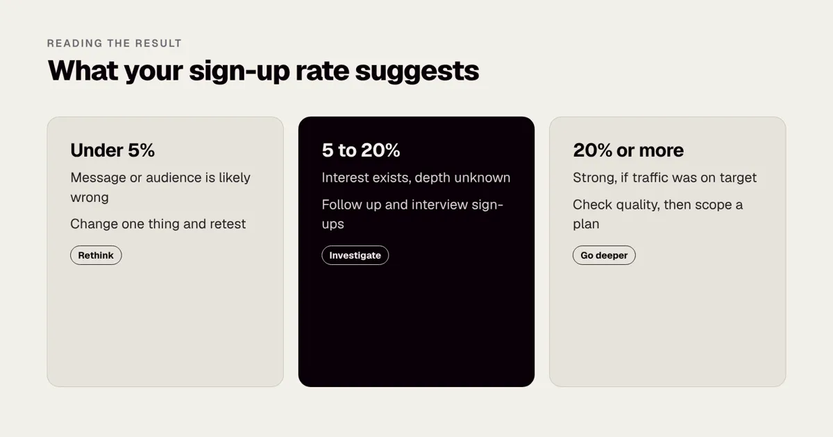
Your pass mark depends on three things: how much you are asking visitors to do, how well targeted the traffic is, and what the idea needs in order to be viable. As a starting point, many practitioners use bands like these for a free email sign-up from well-targeted traffic. They are rules of thumb, not laws, and they vary by market.
| Sign-up rate | Typical reading |
|---|---|
| Under 5% | Weak: the message or the audience is probably wrong |
| 5 to 10% | Mixed: some interest, not yet convincing |
| 10 to 20% | Promising: move to interviews |
| 20% or more | Strong: check the traffic really was your audience |
If you ask for more, expect a lower rate. A refundable deposit page converting at 2% can be a stronger result than an email page converting at 25%, because far fewer people are willing to pay than to type an address.
Work backwards from the business, not only from the page
A useful second check is to work out what each sign-up would need to be worth. Suppose you plan to charge £5 a month and expect one in five waitlist members to become paying customers. Then each sign-up is worth, very roughly, £1 a month in future revenue. If it costs £8 in advertising to get one sign-up, the economics will be hard unless customers stay for a long time or the product can be sold more cheaply through other channels. This does not prove or disprove the idea, but it shows whether the channel you are testing could ever carry the business. See How to calculate app ROI for a fuller approach.
What should a demand-test page contain?
Keep it short. Visitors from an ad give you a few seconds before deciding to stay or leave. A page that works usually has:
- A headline that names the outcome, for example “Split shared household bills without chasing anyone”, not “A revolutionary fintech platform”.
- One supporting line saying who it is for and how it works.
- Three benefits, each in a sentence, ideally with a simple mock screen or illustration.
- One call to action, repeated at the top and bottom.
- A short form, email only. Every extra field lowers conversion.
- A clear privacy note, linking to a privacy policy and saying what you will email them about.
- A line of honest framing, such as “We are building this now. Join the list to hear first.”
Writing a headline that can be tested
Headlines tend to fall into four shapes. Pick one and write three versions so you have something to compare later.
| Shape | Example | Best for |
|---|---|---|
| Outcome | “Never miss a gas safety renewal again” | Clear, measurable benefits |
| Pain | “Tired of chasing tenants and tradespeople?” | Strong, familiar frustrations |
| Audience | “The rent and repairs app for small landlords” | Niche tools |
| Contrast | “Property management without the spreadsheet” | Replacing a poor current habit |
Avoid jargon, avoid superlatives you cannot back up and avoid describing technology. Nobody signs up for “an AI-powered blockchain platform”. They sign up for fewer missed deadlines.
What the supporting sections should do
Below the headline, three short benefit blocks work well. Each should answer “what changes for me?” rather than “what does the product have?”. A mock screen helps, but it need not be a finished design. A simple wireframe, a sketch or a single illustrated screen is enough. Resist the temptation to polish it. If the page looks like a finished product, you may be testing your designer rather than your idea, and you may mislead visitors into thinking the app already exists.
If you are not sure what the page should show, our guide to writing an app specification is useful for sorting a vague idea into a clear description, even though a landing page needs only the front end of that thinking.
How honest should the page be?
Fully honest. Say the product is coming soon. Saying “launching early next year, join the waitlist” is fine. Showing fake testimonials, invented user numbers or claiming the app is available when it is not will break advertising rules and damage trust. In the UK, the Advertising Standards Authority enforces the CAP Code on misleading claims, and other regions have similar rules. You can read about the standards on the Advertising Standards Authority site, and at the time of writing the Competition and Markets Authority also has consumer protection powers over unfair commercial practices. Check the official sources for the country where you advertise. This is general information, not legal advice.
A practical rule is that every claim on the page should be something you could defend if a visitor asked for evidence tomorrow. If you cannot, remove it.
Page speed and mobile first
Most ad traffic arrives on a phone. Test the page on a real phone before you spend anything. It should load quickly, the form should be easy to complete with a thumb and the call to action should be visible without scrolling. A slow or awkward page can lower conversion for reasons that have nothing to do with demand, which would give you a false negative. If you want the background on why speed matters in apps and sites, Why apps feel slow, and how to fix it covers the main causes.
Which conversion signal should you measure?
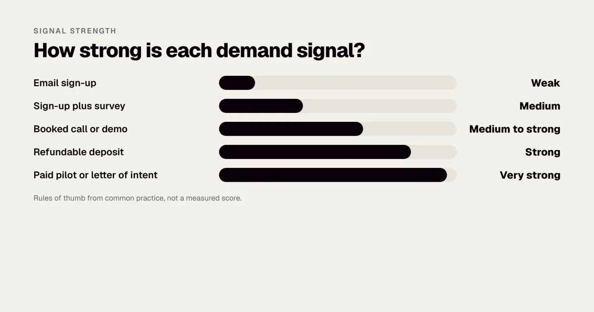
Not all actions are equal. The more effort or money a visitor commits, the more the signal is worth.
| Action | Effort for visitor | Strength of signal | Typical use |
|---|---|---|---|
| Email sign-up | Low | Weak | Early messaging tests |
| Sign-up plus a one-question survey | Low to medium | Medium | Learning what they need most |
| Booking a call or demo slot | Medium | Medium to strong | Business to business ideas |
| Pre-order or refundable deposit | High | Strong | Consumer products with a clear price |
| Paid pilot or signed letter of intent | Very high | Very strong | Enterprise or niche professional tools |
If you can only choose one extra step, add a single question after the email such as “What would you use this for?” The free-text answers are often worth more than the conversion rate itself, because they tell you which part of your promise people care about.
Building a ladder of commitment
Rather than choosing one signal, you can offer a ladder. A visitor who is not ready to pay can still leave an email. A visitor who is ready can book a call or reserve a place. Measuring each rung separately tells you how deep the interest runs.
- Rung one: email address only.
- Rung two: a one-question survey after the email.
- Rung three: an invitation to a 20 minute call in exchange for early access.
- Rung four: an option to reserve a place with a refundable deposit.
The proportion who climb each rung is often more informative than the top-line sign-up figure. If 10% sign up but nobody books a call, interest is shallow. If 3% sign up and half of them book a call, you may have found a small, serious audience.
Should you show a price?
Showing a price on a demand test makes the result harder to get and more meaningful. If your idea is a subscription, try a page that states the planned price, such as “£6 a month, free for the first three months for early members”. Visitors who still join are telling you something about willingness to pay. Compare it with a version that hides the price. A big drop in sign-ups when the price appears is useful information, because it shows where the resistance sits. For deeper pricing work, App monetisation: subscriptions, in-app purchases or ads? walks through the options, and How to design a paywall that converts covers the later stage.
Taking deposits and pre-orders safely
Deposits are the strongest signal a landing page can produce, but they come with obligations. You are taking money for something that does not exist yet. Say clearly what the product is, when you expect to deliver it, and how a refund works. Use a regulated payment provider such as Stripe rather than handling card details yourself, and check consumer protection rules in each country you sell to. Many founders choose a fully refundable reservation, which still filters out casual interest without creating a liability if the project does not proceed. Once you are charging real money, consult a solicitor. This is general information, not legal advice.
How do you get the right visitors?
Quality of traffic matters more than quantity. Ten visitors from your exact audience beat a hundred from a general interest list.
| Channel | Cost level | Speed | Watch out for |
|---|---|---|---|
| Paid search | Medium | Fast | Needs problem-based keywords, clicks cost more for business terms |
| Paid social | Low to medium | Fast | Broad targeting inflates sign-ups from the wrong people |
| Communities and forums | Free | Slow | Rules on promotion, a risk of looking like spam |
| Your own network | Free | Fast | Biased: friends say yes to be kind |
| Direct outreach | Free to low | Medium | Time consuming, but gives honest feedback |
| Newsletters and sponsorships | Medium | Medium | Audience fit varies widely |
| Partnerships with trade bodies or suppliers | Free to low | Slow | Gives access to serious audiences |
Paid search
Search ads suit problems people already look for solutions to. Target a specific problem, such as “invoice software for freelance electricians”, rather than a broad interest. Use Google Ads to set a daily cap, and add negative keywords to avoid clicks from job seekers or students. A budget of £10 to £30 a day for one to two weeks is a typical starting point (market estimate). Write two or three ad variants that match your page headlines, because a mismatch between the ad and the page lowers conversion.
Paid social
Social ads suit ideas people do not yet search for, which includes many consumer apps. Targeting should name an audience in practical terms, such as age range, location and a clear interest, and the creative should show the problem rather than the product. The danger is that broad targeting delivers cheap clicks from people with no real interest. If your cost per click looks very low and your conversion is poor, suspect the audience rather than the page.
Communities and direct outreach
Relevant forums, professional groups and newsletters can be excellent for a niche idea, where posting is allowed. Read the rules first, and contribute before you promote. Direct outreach works well for business ideas: message 50 to 100 people in your target group, ask for 60 seconds of honest feedback on the page and offer something in return. The replies often teach more than the conversion data does. Treat your own network as a secondary source, because friends and colleagues are kinder than strangers.
How many visitors are enough?
Aim for at least 300 visitors from your real audience, and ideally 500 to 1,000. With 100 visitors, a difference of five sign-ups changes the percentage by five points, which is mostly noise. With 1,000, the same five sign-ups move it by half a point. If you cannot reach 300 because your audience is tiny, treat the result as a hint and rely more on interviews and booked calls.
Not sure whether your idea is worth testing? We will tell you straight whether a quick test or a full discovery phase makes more sense. Book a 30-minute call with a co-founder.
What does a landing page test cost and how long does it take?
Most of the cost is advertising, with smaller amounts for tools and your own time. The ranges below are market estimates for a first test, not quotes.
| Item | Typical cost | Notes |
|---|---|---|
| Page builder or no-code tool | £0 to £40 a month | Many have free or low-cost tiers |
| Domain name | £10 to £20 a year | Optional for a first test |
| Email capture or waitlist tool | £0 to £30 a month | Check where data is stored |
| Paid advertising | £200 to £1,000 | The main cost |
| Analytics | £0 to £20 a month | Choose tools that respect consent rules |
| Design help | £0 to £500 | Optional, keep it simple |
| Typical total | £200 to £1,500 | Depends on audience cost |
Costs rise with expensive audiences. A business owner in a competitive trade may cost many times more per click than a general consumer. If your first week shows costs far above this range, consider a different channel before increasing the budget.
A realistic four week plan
| Week | Focus | Output |
|---|---|---|
| 1 | Hypothesis, audience, page build, tracking and consent set up | A live page that works on phones, with a pass mark written down |
| 2 | Small budget run, check tracking, fix problems | Clean data and a first read on cost per click |
| 3 | Main traffic push, outreach in parallel | 300 to 1,000 visitors and a stream of survey answers |
| 4 | Analysis, follow-up emails, decision | A written result and a recommendation |
The calendar is a guide. Some tests finish in a fortnight, particularly when the audience is easy to reach, and others need six weeks when traffic is thin.
How do you track results without breaking privacy rules?
Tracking is where many founders slip. In the UK and EU you generally need consent before setting non-essential cookies or similar technologies, and you need a lawful basis and clear information when you collect personal data such as an email address. Check the current guidance from the ICO in the UK, or the European Data Protection Board and your national regulator in the EU. At the time of writing, requirements differ between countries, so check the official source for where your visitors live. This is general information, not legal advice.
A practical, low-risk setup looks like this:
- Use analytics that work without invasive tracking, or only load tracking tools after a visitor consents.
- Ask for the minimum. An email address is enough. Avoid collecting names, phone numbers or birth dates unless you need them for the test.
- Say what you will do with the data. For example “We will email you about this product only, and you can unsubscribe at any time.”
- Keep a simple record of consent with the date and wording shown.
- Delete data you no longer need, including lists from failed tests.
- Use a provider that stores data in a region you are comfortable with, and check its terms.
Our guide to UK GDPR for mobile apps covers what changes when the product itself launches, and UK GDPR lawful bases for apps explains the basis for sending messages. If you plan to track what people do on the page in more detail, App analytics: what to track from day one shows the habit of choosing a few meaningful events instead of everything.
Setting up the numbers you need
You need only a handful of figures to read the test properly.
- Visitors by source and by ad or message.
- Conversions at each rung of your ladder.
- Cost per visitor and cost per conversion.
- Survey answers in the visitors’ own words.
- Time on page and device type, which help spot technical problems.
Set up a simple spreadsheet before launch and update it daily. A test that is not recorded in a table is easy to misremember.
How do you read the results?
Treat the numbers as ranges, not verdicts. With 500 visitors, a 12% sign-up rate means around 60 people, and the real rate for your wider audience could be a few points either side.
| Visitors | Sign-up rate | Reading |
|---|---|---|
| 300 to 1,000 | Under 5% | The message or audience is probably wrong, change one and retest |
| 300 to 1,000 | 5 to 10% | Mixed, interest exists but is not strong |
| 300 to 1,000 | 10 to 20% | Promising, move on to interviews |
| 300 to 1,000 | 20% or more | Strong, but check the traffic was truly your audience |
These bands are rules of thumb from common practice, and they shift by market and by how much you ask for.
Look beyond the headline rate
The headline rate hides several things worth separating.
- By source. If search traffic converts at 14% and social traffic at 3%, you have an audience finding rather than a demand problem.
- By message. If one headline wins by a wide margin, that headline may be the product’s real promise.
- By device. A big gap between phone and desktop often signals a page problem.
- By quality. Do sign-ups answer the survey? Do they open your follow-up email? Do they book a call? A list of addresses that never respond is worth less than a short list of engaged people.
- By cost. Compare cost per sign-up with what each customer could be worth.
Follow up quickly
Email everyone who signed up within a week. A short note thanking them, repeating the promise and asking one question will tell you how many care. Reply rates and open rates are rough signals, and the replies themselves are often the best research you will get. Offer a 15 minute call to a handful of the most engaged and move straight into interviews. How to run user interviews before building explains how to run those conversations without leading people.
What a poor result usually means
A weak result has four common causes: the audience was wrong, the message was unclear, the page had a fault, or the idea has little demand. You cannot tell which until you change one thing at a time. Alter the message first, because it is cheapest, and then the audience. If two honest rounds produce almost no interest, accept the answer. It cost a few hundred pounds, and you have saved yourself a much larger sum.
How should you test two messages against each other?
When the first result is mixed, a simple comparison of two headlines can show which direction to take. The rules are straightforward.
- Change one thing only, usually the headline.
- Split traffic evenly between the two versions.
- Run both at the same time, not one after the other.
- Decide in advance how many visitors each version needs, such as 200 each.
- Keep the winner only if the difference is clear and sizeable.
With small samples, differences of a point or two are not reliable. If one headline gets 12% and the other 11%, call it a tie and choose on your own judgement. If one gets 16% and the other 6%, you have a real signal. Avoid declaring a winner after the first day, since early numbers swing widely.
What do worked examples look like?
These are hypothetical, with simplified numbers, to show how the decisions flow.
Example one: a landlord compliance app
A founder wants to build an app that helps landlords of small portfolios track rent, repairs and compliance certificates.
- She builds a one-page site in an afternoon with a no-code tool, with the headline “Know which of your rental properties needs attention this month”.
- She spends £450 on search ads aimed at “landlord compliance reminders” and similar phrases over two weeks, and messages 60 landlords she finds in a property forum.
- 640 people visit. 58 leave an email, which is 9%. Of those, 31 answer the one-question survey.
- The answers cluster: 19 of the 31 mention gas safety and electrical certificate expiry, and only 4 mention rent tracking.
The conversion rate is mixed, but the survey changes the plan. The first version should focus on certificate reminders, not full property management. She rewrites the headline around certificates, retests with £300 of ads, and sees sign-ups rise. She then interviews eight of the landlords before writing a specification. The test cost under £1,000 and moved the first build from a broad product to a focused one.
Example two: a scheduling tool for a professional service
A founder with a background in physiotherapy wants an app for small clinics to manage rebooking. Search ads for clinic software are expensive, so he spends £700 over three weeks and also emails 80 clinic owners directly.
- 310 visitors, 19 sign-ups (6%), 9 booked a 20 minute call, 6 attended.
- Five of the six who attended said they already used a booking system but disliked reminders that went out late.
The low sign-up rate looks weak, but 9 booked calls from 19 sign-ups is a strong ladder result for a business audience. The founder learns that the market is crowded, and that the opportunity lies in a narrow feature, not in a whole booking platform. He decides to test an add-on idea for existing systems instead of building a replacement. The decision came from the ladder, not the headline rate.
Example three: a consumer savings app with a deposit
A team plans a savings app for teenagers. They test a page with a refundable £5 reservation. Out of 900 visitors from social ads aimed at parents, 14 reserve (1.6%) and 160 leave an email only.
For a deposit, 1.6% is encouraging. The team calculates cost per reservation at £22 and concludes the channel is too expensive for a low priced product. They look for cheaper routes such as schools and parent communities before building. The test did not say “do not build”. It said “do not rely on paid social to find customers”, which is just as valuable. Anything involving children and money needs careful legal advice on privacy and financial rules, so COPPA and apps used by children and the ICO children’s code guide are worth reading before you collect any data.
What these examples have in common
In each case the result mattered less than what the team learned about which audience, which message and which channel worked. A landing page test is a way of asking better questions for little money.
What are the limits of a landing page test, and what mistakes should you avoid?
Be wary of these traps:
- Fake-door bias. People click “sign up” more easily than they would pay or change habits.
- Wrong audience. Cheap clicks from a general audience inflate nothing but your ad bill.
- Over-polished pages. If the page looks too good, you may be testing your designer, not your idea.
- Testing too many ideas at once. Change one thing per round, or you will not know why results moved.
- Ignoring competitors. If three similar apps exist, a good conversion rate may only show the problem is real, not that you can win.
- Moving the goalposts. Changing your pass mark after seeing the data defeats the point of the test.
- Counting friends. Strip out your own network before calculating the rate.
- Mistaking sign-ups for customers. Many waitlist members never convert, whatever the list size.
- Promising what you cannot deliver. Do not name a launch date or feature you are not prepared to stand behind.
Mistakes that look like successes
| Apparent success | Possible hidden problem | How to check |
|---|---|---|
| Very high sign-up rate with a tiny budget | Wrong or friendly audience | Look at traffic sources and ask five sign-ups who they are |
| Large list, no replies | Sign-ups from curiosity, not need | Send a one question email and measure replies |
| High clicks, low sign-ups | Ad promises more than the page | Compare ad wording with headline |
| Strong rate on one headline only | Message works, product unclear | Test the product description separately |
| Many sign-ups from one country | Audience mismatch with your launch plan | Break results down by location |
A passed test is a reason to spend more time, not the full budget. Next steps are interviews, a clickable prototype and a clear MVP. Our Mobile Product Discovery Sprint is a fixed-price £9,500 way to do this with a team, and a lighter route is covered in What happens in a discovery phase, and why it saves money.
When should you stop, change direction or go on?
Write the decision rules before you start, so the result drives the action.
| Result | What it suggests | Next step |
|---|---|---|
| Clearly above your pass mark, engaged follow-ups | Real demand for this promise | Interviews, then a prototype and a scoped plan |
| Above your pass mark, but few replies | Curiosity more than need | Tighten the message, ask for a stronger action |
| Mixed, with a clear pattern in survey answers | The audience cares about something narrower | Rewrite around that, retest once |
| Mixed with no pattern | Unclear proposition | Return to interviews before spending more |
| Well below your pass mark after two rounds | Little demand or wrong channel | Stop, or try a different audience once |
| Strong demand but hard to reach cheaply | Channel problem | Test partnerships, communities or a different price |
Stopping is a legitimate outcome. Founders who treat a failed test as a failure of the person tend to repeat it until they see a number they like. Treat it as information that has saved you money.
What should you do with the results?
Use the landing page findings to shape the first version rather than to greenlight everything at once.
- Keep the winning promise as the first screen of the app and in the store listing. How to write an App Store description shows how to carry it through.
- Use the survey answers to decide features for version one, and rank them with MoSCoW prioritisation.
- Hand your waitlist a beta programme as the next step.
- Move the same page into your launch campaign later, and use it to get your first 1,000 users.
- Take the numbers into a business case for the app if you need approval from a board or investor.
Turning a result into a budget conversation
Founders often ask what a good test result means for cost. A strong result does not shrink the build, but it gives you evidence to scope it sensibly. A clear promise, a ranked feature list and a list of people to interview let a supplier quote against something real. Our guide on how to plan an app budget for the next financial year is useful for turning that into a plan, and How to cut app development costs without cutting quality shows where scope can safely be trimmed.
Rounded Labs has worked since 2007, and our 19 years of experience say the same thing every time: the earlier you learn what people really want, the less you pay to change it. Our projects are fixed price, agreed before development starts, and typically run £30,000 to £250,000+. See our pricing page for how that works, or talk to a co-founder about whether your test results justify starting. For a sense of what disciplined scoping looks like on a large product, read how we worked on Waterstones, where an app, a mobile site and an eBooks API were delivered in 12 weeks.
A short checklist before you press publish
- The hypothesis and pass mark are written down.
- The headline names an outcome in plain words.
- There is one call to action and a short form.
- The page is honest that the product is coming.
- The privacy notice and consent wording are in place.
- Tracking works on a phone, and you have tested the form.
- A spreadsheet is ready for daily numbers.
- Your friends and network are tracked separately.
- You have decided what you will do at each result.
Frequently asked questions
How many visitors do I need for a meaningful test?
Aim for at least 300 visitors from your real target audience, and ideally 500 to 1,000. Below that, a handful of sign-ups can swing the percentage wildly. If you cannot reach that many, treat the result as a hint and rely more on interviews.
How much should I spend on ads?
A first test normally needs £200 to £1,500 in total, depending on how expensive your audience is to reach, which is a market estimate. Business audiences cost more per click than general consumers. Start with a small budget, check that tracking works, and only then scale.
Is it legal to take pre-orders for an app that does not exist?
It can be, but be careful. Say clearly what the product is, when you expect to deliver it and how a refund works. Take payments through a regulated provider and check consumer protection and advertising rules where you sell. This is general information, not legal advice, and you should check the official sources or ask a solicitor.
Should I use a no-code tool or build the page properly?
Use a no-code or template tool. The goal is speed and cheap changes, and you will probably rewrite the page after the first round. Save design and engineering effort for when the demand signal is clear.
What if nobody signs up?
Change one variable, either the message or the audience, and retest. If two honest rounds produce almost no interest, you have learned something valuable for a few hundred pounds, which is far cheaper than discovering it after launch.
Is a waitlist the same as proof of demand?
No. A waitlist shows curiosity. Stronger proof comes from people who book a call, reserve a place with a refundable deposit or agree to a paid pilot. Use the waitlist as a source of people to talk to, not as the final answer.
Can I run the test in more than one country?
Yes, but run separate pages or at least separate tracking for each, because language, price and rules differ. Start with the market you plan to launch in first, and use the result to decide whether wider testing is worth the cost.
Official sources and further reading
Talk it through with one of our co-founders. 30 minutes, no pressure.