

You can run a useful usability test with five people, a clickable prototype and an afternoon, for well under £500 in incentives and tools. Ask each person to complete three or four real tasks while you watch silently, note where they hesitate or fail, then fix the problems that appear more than once. Five users typically surface most major issues.
We design and build apps for brands such as Superdry, where a flow that confuses shoppers in one market costs sales in over 100 countries, and for first-time investors on Dabbl, where a confusing screen erodes trust quickly. In both cases, watching real people use early designs saved far more than it cost. This guide covers how to plan, recruit, run and act on a small usability test, and how it fits with the wider design and build services we offer. Our projects are fixed price, agreed before development starts, and typically run from £30,000 to £250,000+; the pricing page explains how that works. Cost figures in this guide are market estimates, not quotes.
Key facts
- Five participants per round is a sensible starting point; run a second round after you fix what you find.
- You can test a clickable prototype before any code is written, which is the cheapest moment to change anything.
- Typical budget (a market estimate, not a quote): £0 to £500 in tools and participant thank-you vouchers, plus 10 to 20 hours of your own time. Check each tool’s pricing page for current costs.
- Moderated sessions (you watch live) give richer insight; unmoderated tools are cheaper per session but shallower.
- Always test with people who resemble your real users, not colleagues and friends.
- Record what people do, not what they say they like, and rank every problem by severity before you fix anything.
What is a usability test, and why does it work?
A usability test puts a real person in front of your product, or a prototype of it, and asks them to complete realistic tasks while they think aloud. You are not asking what they like. You are watching what they do. People are poor at predicting their own behaviour, so an opinion in a survey is weaker evidence than a user who taps the wrong button three times in a row.
It works because the people who build a product know it too well. A founder knows what “Sync” means, what the grey icon in the corner does and which of the two similar menus holds the setting. A new user knows none of this. Every product team suffers from this “curse of knowledge”, and no amount of internal review fully removes it, because the reviewers are the same people who made the decisions.
The Nielsen Norman Group has long argued that small rounds of about five users find the majority of the most serious problems, so several small rounds beat one large one. The reasoning is that the first few people reveal the big, repeated problems, and after that you start seeing the same issues again. Check the Nielsen Norman Group site for the current statement of that reasoning and its limits, because it applies best to one user group and one set of tasks.
What a usability test is not
It helps to be clear about what you are not doing, because the wrong method gives confident but wrong answers.
| Method | What it tells you | What it cannot tell you |
|---|---|---|
| Usability test | Where people get stuck and why | How many people overall will get stuck |
| Survey | Opinions and stated preferences at scale | What people actually do on screen |
| Focus group | Group attitudes and language | Individual task success |
| Analytics | What people did and where they left | Why they did it |
| A/B test | Which of two versions performs better | Why one version wins |
Analytics and A/B tests need a live product with traffic. A usability test works before launch, which is why it earns its place early. Once you are live, the two methods complement each other: analytics shows where people drop out, and a small test shows why. Our guide to app analytics from day one covers what to measure, and app retention metrics explains how to read them.
When should you test, and what should you test?
Test as early as something clickable exists. A prototype built in a design tool is enough, and changing a screen at that stage costs minutes where changing built software costs days. If you are weighing options for what to put in front of users, our guide on MVP vs prototype explains what each is for, What is a prototype? covers the basics and What is an MVP? explains the other end of the scale. If you are still deciding whether to build at all, start with how to validate an app idea before you spend £50k.
There are four moments when a small test pays back most.
- Before design is finished. Paper sketches or low fidelity wireframes can be tested with a handful of people. You learn whether the structure makes sense before anyone spends time on colour and polish. What is a wireframe? is a useful primer.
- Before development starts. A clickable prototype of the key flows. This is the most valuable moment, because you are about to commit most of your budget.
- Before launch. A build that works on a real phone, tested on the devices your customers use. You are looking for friction and wording problems, not for bugs, which belong to the testing described in App testing explained: QA, UAT and beta testing.
- After launch. When analytics shows a drop in a specific flow, a test with five people who did not complete it will usually show the reason.
Choosing the tasks
Choose three or four tasks that matter to the business. Each task should be a realistic goal, not an instruction to find a feature. Good candidates:
- Sign up and reach the first useful screen.
- Find a specific item or feature and add it to a basket or list.
- Complete a payment or a key action.
- Change a setting or cancel something.
- Recover from an error, such as entering the wrong password.
Avoid testing everything at once. Short sessions of 20 to 30 minutes keep people focused and keep your costs down. If you have more than four important flows, run more than one round with different tasks, rather than a long session where people tire and the last task gets less attention than the first.
A useful way to pick tasks is to list your product’s top five jobs from the user’s point of view, then rank them by two things: how often users do them and how costly it is when they fail. Payment and sign up score high on cost of failure. Changing a profile photo scores low on both. Test the high scorers first. The format of a user journey and a set of user stories can help you do that ranking if you already have them written.
Write task scenarios, not instructions
A weak task reads: “Click on Classes and then press Book.” That tells the participant exactly where to go, so you learn nothing. A strong task reads: “You want to do something active on Saturday morning. Find a class and reserve a place for yourself.” The participant must work out the route, and you see whether your labels and layout support them.
Good scenarios share three traits. They give a reason (“your friend has recommended a yoga class”), they avoid the words that appear on your buttons, and they have a clear end (“you have a confirmation you could show a friend”). Write them on cards, one per card, and hand them over or read them aloud one at a time.
How much does a budget usability test cost?
Costs are small because the main inputs are your time and a few vouchers. These figures are market estimates for a first round of five users. Tool prices change often, so check each vendor’s own pricing page, such as Figma’s pricing page for prototyping, before you plan around any number here.
| Item | DIY budget option | Typical cost (market estimate) |
|---|---|---|
| Prototype | Clickable mock-up from your designer or a design tool | Often part of design work, or £0 to £15 for a tool |
| Participants (5) | Your own customers, waitlist or social followers | £0 to £50 each in vouchers |
| Video call and recording | A free or low-cost meeting tool | £0 to £15 |
| Unmoderated testing platform | Pay-per-session service | £30 to £100 per session |
| Note-taking and analysis | A spreadsheet and a shared document | £0 |
| Your time | Planning, running and analysis | About 10 to 20 hours |
A full first round of five moderated sessions with vouchers usually lands between £0 and £300. A recruitment agency or a specialist lab would cost several times that, which is worthwhile for regulated or high stakes products but unnecessary for a first check. The most common mistake is to treat the cash cost as the whole cost. Your own time, and anyone you borrow to take notes, is the larger part of the bill.
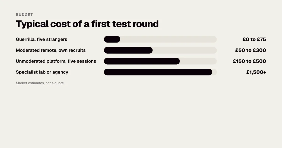
Three budget levels compared
| Approach | Typical cost | Time | Best for |
|---|---|---|---|
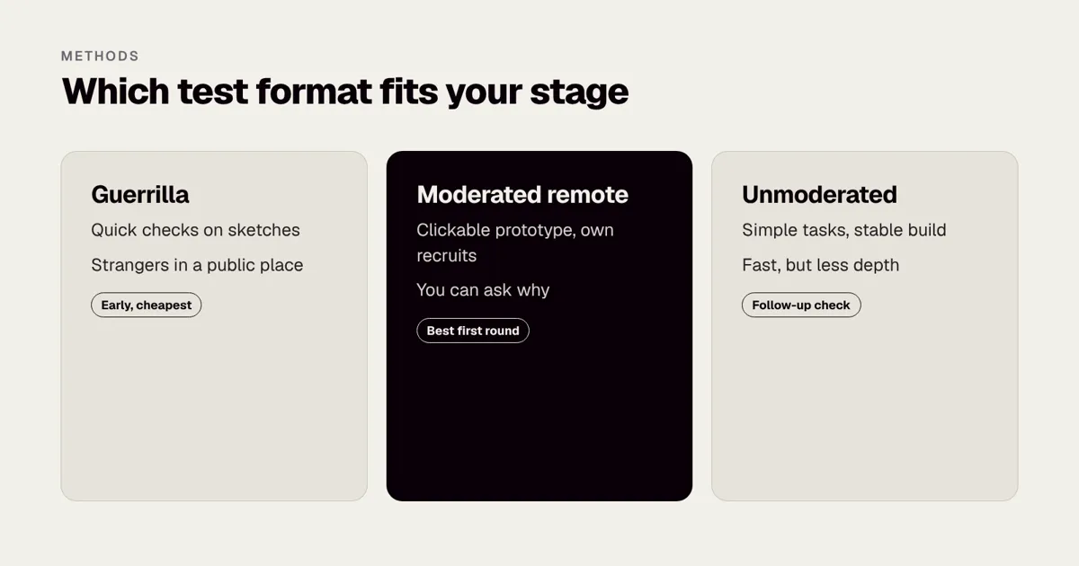
| Guerrilla (in a cafe or office, five strangers) | £0 to £75 in coffee and vouchers | 1 day | Early sketches, quick sanity checks |
| Moderated remote (video call, own recruits) | £50 to £300 | 3 to 5 days | Clickable prototypes and live apps |
| Unmoderated platform (pay per session) | £150 to £500 for five | 2 to 3 days | Simple tasks where you do not need follow-up questions |
Guerrilla testing means approaching people in a public place for ten minutes each. It is fast and cheap, but your participants are whoever happens to be there, so it suits general consumer products better than specialist ones. Unmoderated tools record a person completing tasks on their own, which saves your time but removes your ability to ask “what did you expect to happen there?” That follow-up question is often where the best insight comes from. For a first round, we generally recommend the moderated remote option.
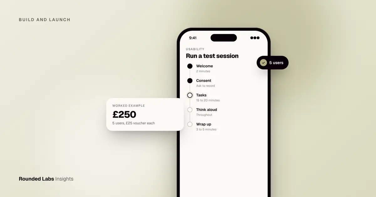
Worked example: testing a booking app on £250
Imagine a founder with a booking app for local fitness classes. The prototype has twelve screens. She books five sessions of 25 minutes with people from her waitlist, offering a £25 voucher each, so £125 in thank-yous. She adds £20 for a call tool and keeps the rest as slack, about £250 in total with a spare.
She sets three tasks: find a class for Saturday, book it, then cancel it. In session one, the user cannot find the cancel button. In sessions two and four, the same thing happens. Two of the five misread “Credits” as a payment screen. That is a clear pattern: one navigation fix and one wording fix, made in an afternoon. A second round of three people the next week confirms both problems are gone. The cost was a few hundred pounds and one week, and it avoided building the wrong cancellation flow.
Look at how the numbers fell out. Three of five users hitting the cancel problem tells you it is serious and common. Two of five misreading “Credits” tells you it is a real wording issue but less severe. One user who disliked the colour of the header is a single opinion and goes in the “watch” column, not the fix list. This sorting by frequency and severity is the heart of the analysis, and we cover it in detail below.
Want a second pair of eyes on your prototype? We run test rounds as part of discovery and design, and tell you plainly what to fix first. Book a 30-minute call with a co-founder.
How do you recruit the right people on a budget?
Start with who you already reach. A mailing list, existing customers, a waitlist, a community group or followers on social media are all free and well matched. Offer a fair thank-you for 20 to 30 minutes of their time, and be clear about what you will record and why.
Recruitment sources compared
| Source | Cost | Quality of match | Watch out for |
|---|---|---|---|
| Existing customers or waitlist | £0 plus voucher | High | They may be more forgiving than new users |
| Social followers and communities | £0 plus voucher | Medium to high | Self selected enthusiasts |
| Friends of friends | £0 plus voucher | Medium | Politeness bias is smaller than with close friends |
| Panel or platform recruitment | £30 to £100 per person (market estimate) | Medium to high | Professional testers who know the format |
| Street or cafe approach | £0 to £10 each | Low to medium | Not your target audience unless the product is general |
The screener: five questions that matter
A screener is a short form that decides who qualifies. Keep it to five questions or fewer. Ask about behaviour, not opinions: “When did you last book a fitness class online?” works better than “Do you like exercise?” Include one question that hides which answer qualifies, so people cannot guess their way in. Include a question on device use, so you know whether you need iPhone or Android, and a question on availability.
Two cautions. First, do not test only with friends, who are polite and biased. Second, include people who differ from you: older users, people with less confidence on a phone, and people who use assistive tools. Accessibility problems are usability problems. The W3C’s Web Content Accessibility Guidelines are a good checklist for what to look for, and App accessibility: the European Accessibility Act and UK guidance and How to add accessibility features to your app go deeper. If your users are in regulated groups, such as children, get proper consent and legal advice before recording anyone.
Incentives and fairness
A voucher of £15 to £50 for a 25 to 30 minute session is typical for consumer research at the time of writing (a market estimate). Pay more for specialist participants such as nurses, accountants or company directors, whose time costs more. Pay everyone, including no-shows who gave notice, and send the voucher straight after the session rather than weeks later. People talk, and a reputation for paying promptly makes the next round far easier to recruit.
Plan for no-shows. Recruit seven people to get five sessions, or schedule a reserve. A slot that falls through costs you momentum, not just money.
What to do about consent and data
You are recording people’s voices and screens, which is personal data. Tell people before the session what you will record, why, who will see it and how long you will keep it. Keep it simple and honest. Delete recordings when you no longer need them. For the rules in the UK, the Information Commissioner’s Office publishes guidance, and our guide to UK GDPR for mobile apps covers the principles. This is general information, not legal advice; check the official guidance, and take advice if you test with children or handle sensitive data.
How do you set up the prototype and the room?
You do not need a laboratory. You need a stable prototype, a quiet space and a way to see what the participant does.
Prepare the prototype
A prototype only needs to support the tasks you are testing. Make sure every link a participant is likely to try goes somewhere, even if it is a polite “not part of this test” screen. If a participant taps a dead area three times, you lose the session to prototype problems, not design problems. Run the test yourself twice and ask a colleague to do it once before the real sessions. Our guides on how to review app designs as a non-designer and how to sign off a design before build give a good picture of what a ready prototype looks like.
A good prototype has realistic content. Lorem ipsum text hides wording problems, and fake prices of £0.00 confuse people. Use plausible names, dates and prices. If your design uses a design system, reuse real components so the test reflects what will be built.
Remote session checklist
- Send a calendar invite with a link, the start time and a note on what device to use.
- Test screen sharing and audio five minutes before.
- Ask the participant to share their screen, or to hold their phone up to the camera if you are testing a mobile prototype in person.
- Start recording only after consent.
- Keep a second person on mute taking notes, if possible.
- Close notifications on your own machine.
In person session checklist
- Book a quiet room and put a “testing in progress” sign on the door.
- Provide the device the participant would normally use, charged and signed out of your own accounts.
- Sit slightly behind and to the side, not across a table, so the participant does not watch your face.
- Have water and a clear way to end the session if they feel uncomfortable.
- Record the screen, and the voice if you have consent.
How do you run the session?
Keep to a simple script and a calm tone. A good session is 25 to 30 minutes, with a short gap of 10 to 15 minutes between sessions to write up notes while they are fresh.
- Welcome (2 minutes). Explain that you are testing the design, not the person, and that there are no wrong answers. Say that you did not design it, if that is true, or that you will not be offended whatever they say. People soften their feedback to be polite.
- Consent. Ask permission to record the screen and voice, and say how you will use it.
- Warm up questions (3 minutes). Ask about how they currently do the thing your product helps with. This gives context and puts them at ease.
- Tasks (15 to 20 minutes). Read each task aloud as a situation, such as “You want to book a class for Saturday morning.” Do not name buttons or hint at the route.
- Think aloud. Remind them to say what they are looking at and what they expect to happen.
- Wrap up (3 to 5 minutes). Ask what felt confusing, what they liked and what they would change. Thank them and confirm the voucher.
The hardest skill: staying quiet
Your hardest job is staying quiet. When someone struggles, resist the urge to help. Note the moment, count how long they take, and move on only if they are stuck completely. If they ask “Is this right?”, reply with “What would you expect?” or “What do you think?” The aim is to keep the participant doing the thinking.
Silence feels long to the facilitator and short to the participant. Count to ten in your head before you say anything. Most of the time the participant fills the gap with something useful, such as “I would expect a back button here.”
Questions that help, and questions that harm
| Avoid | Why it harms | Ask instead |
|---|---|---|
| “Did you find that easy?” | Leads to a polite yes | “How did that feel compared with what you expected?” |
| “Would you use this?” | People say yes to be kind | “When would you last have needed something like this?” |
| “Don’t you think the button is clear?” | Suggests the right answer | “What do you think that button does?” |
| “What would you change?” | Asks the user to design | “What did you expect to happen when you tapped that?” |
| “Is that what you wanted?” | Closed question | “Tell me what happened there.” |
Handling difficult moments
The participant freezes. Normalise it: “That is useful to see, take your time.” If they stay stuck for more than two minutes, ask what they would do if you were not there. If still stuck, mark the task as failed and move on.
The participant praises everything. Politeness bias. Ask for something that annoyed them, or a time when they would give up. Watch behaviour rather than words.
The prototype breaks. Apologise briefly, reset and carry on. Note the issue so you can separate prototype failures from design failures in analysis.
The participant wants to redesign the app. Thank them and ask what problem they are trying to solve. The need behind the idea is the useful data; the proposed fix usually is not.
How do you turn what you saw into changes?
Within a day, list every problem you observed on a sheet, one row each, and mark how many users hit it. Then rate severity.
- Blocker: the user could not complete the task.
- Major: they completed it with real difficulty or after a wrong turn.
- Minor: a small snag or moment of doubt.
Fix blockers that more than one person hit first, then majors. Ignore one-off personal preferences, but keep a note, because a second round may show the same comment again. Write one sentence for each fix and give it an owner.
A simple findings table
| Problem | Users hit | Severity | Likely cause | Proposed fix | Owner |
|---|---|---|---|---|---|
| Could not find cancel | 3 of 5 | Blocker | Cancel hidden in menu | Add button on booking screen | Designer |
| “Credits” read as payment | 2 of 5 | Major | Ambiguous label | Rename to “Class passes” | Content |
| Date picker slow on small phones | 1 of 5 | Minor | Wheel control | Watch in round two | Developer |
| Disliked header colour | 1 of 5 | Opinion | Personal taste | No action | None |
Count the pattern, not the quotes
Beginners often pick the most vivid quote and build a change on it. Instead, count how many participants hit each problem and rank by severity multiplied by frequency. A blocker hit by three of five people beats a cosmetic point raised passionately by one person. Include a short list of things that worked well, because it protects those parts of the design from being “improved” by accident.
Share results quickly
A one page summary is more likely to be read than a long report. Include the tasks, the top five problems with a short video clip or screenshot for each, and the planned fixes. Short clips are powerful in a meeting, because stakeholders who watch someone struggle for 30 seconds usually stop arguing about opinions. The UK government’s Service Manual on user research is a good model of how to share findings with a whole team.
If you are redesigning an existing app, our guide to how to plan an app redesign shows where testing fits, and how to review app designs as a non-designer helps you judge the changes. Once the designs are ready, how to sign off a design before build covers the final check.
How do you test on mobile specifically?
Mobile adds issues that a desktop test never meets. Fingers are bigger than cursors, screens are smaller, people use one hand, and the context is messy: on a train, in a queue, in poor light. Platform guidance, such as Apple’s Human Interface Guidelines, sets out minimum touch target sizes and navigation patterns that your prototype should respect, and it is a helpful reference when you decide whether a problem is a design flaw or a platform convention users already know.
Practical points for a mobile test:
- Use a real phone for a built app or a prototype link. Testing a mobile design in a desktop window hides thumb reach and touch target problems.
- Test on both platforms if your audience is split. Back gestures, menus and keyboards behave differently on iOS and Android.
- Watch the thumbs. Where does the participant reach awkwardly? Primary actions at the top of a tall phone are often hard to hit.
- Test with the keyboard open. Forms that look fine on a large canvas can hide the submit button behind the keyboard.
- Try poor conditions. A task on a slow connection or in bright light shows problems that an office hides. If your product needs to work without a signal, our guide on how to make your app work offline explains the design choices.
What are the most common mistakes?
- Testing too late. A test on a finished build finds problems that are expensive to fix. Test the prototype.
- Testing with the wrong people. Colleagues, friends and family know too much and say too little.
- Leading the participant. If you tell people where to tap, you test your instructions, not your design.
- Helping too soon. Silence is uncomfortable but essential.
- Testing too many things. Four tasks done well beat ten tasks rushed.
- Treating five users as proof. Five users reveal problems, not percentages. Do not report “60% of users failed” from a sample of five.
- Not recording or note taking. Memory is selective, and you will remember the confirming evidence best.
- Fixing everything. Prioritise by severity and frequency or you will redesign the whole app on the basis of one comment.
- Never testing again. One round is a start. A second round shows whether the fix worked.
- Ignoring accessibility. If nobody in your sample uses assistive technology, you are blind to a whole class of problems.
When is five users not enough?
The five user guideline is a starting point, not a law. It works best when the product has one main user group, a small number of core tasks and a problem you can fix before running again. There are cases where you need more or different people.
| Situation | Adjustment |
|---|---|
| Two or more very different user groups (for example shoppers and shop staff) | Test about five of each group |
| Highly specialist users (for example clinicians) | Test fewer sessions but pay more and prepare more context |
| You need to compare two designs | Use more participants, or run an A/B test once live |
| You need numbers, such as task success rates | Use a larger unmoderated study or analytics |
| Strict regulation or safety risk | Use professional recruitment and formal protocols |
The guidance from the Nielsen Norman Group and the UK Service Manual both stress that testing is iterative: test, fix, test again. The value is in the loop, not in any single sample size.
Moderated or unmoderated?
| Factor | Moderated | Unmoderated |
|---|---|---|
| Cost per session | Low cash, higher time | Higher cash, low time |
| Depth of insight | High: you can ask why | Lower: you see what, not why |
| Speed | Needs scheduling | Results in hours |
| Risk | Facilitator bias | Participants misunderstand tasks |
| Good for | Prototypes and complex flows | Simple, well defined tasks on stable builds |
A mix is often best. Use moderated sessions to find problems, then a short unmoderated round to check that a fix works across a wider group.
What does a complete test plan look like?
Here is a one page plan you can copy. It fits a first round of five users for a consumer app.
- Goal. One sentence: “Find out whether new users can book and cancel a class without help.”
- Participants. Five people who booked a fitness class online in the last three months, mix of ages, mix of iPhone and Android.
- Tasks. Three scenarios written on cards.
- Prototype. Link, version number, known gaps.
- Schedule. Five sessions of 30 minutes across two days, with 15 minute gaps.
- Roles. One facilitator, one note taker.
- Materials. Consent text, script, task cards, voucher codes, findings sheet.
- Success measures. Task completion without help, time on task, and number of wrong turns.
- Analysis. Same day debrief after each session, findings table within 24 hours of the last one.
- Decision. Fix blockers and majors, schedule round two within two weeks.
Measures worth recording
You do not need a statistics package, but a few simple measures make results clearer:
- Task completion. Did they succeed without help, with help, or not at all?
- Time on task. Rough timings from the recording are enough.
- Errors. Count wrong taps or wrong routes.
- Confidence. Ask “How confident are you that you finished?” on a scale of 1 to 5.
- Ease rating. A single question after each task, “How easy was that?” from 1 to 5, gives a quick comparison between rounds. Treat it as a pointer, not as proof.
How does usability testing fit into a wider project?
Testing is cheapest and most valuable early. Before you commit to a build, validate the idea itself; see how to validate an app idea. Then use a discovery phase to settle scope and flows; What happens in a discovery phase explains the stages. Our Mobile Product Discovery Sprint is a fixed price £9,500 option that includes prototype work you can test straight away. Projects overall are fixed price, agreed before development starts, typically £30,000 to £250,000+, and you can see how that works on our pricing page.
It also reduces the cost of the build itself. Problems found in a prototype are cheap to fix, and each one you remove before development is a change request you never need to price. Our guides to how to write an app specification and how to brief an app development agency show how test findings feed into a clear brief, and How to cut app development costs without cutting quality lists testing early among the most reliable ways to save money.
A realistic timeline
| Day | Activity |
|---|---|
| 1 | Write goal, tasks and screener; finalise prototype |
| 2 | Send invitations; run a pilot session with a colleague |
| 3 to 4 | Run five sessions; debrief after each |
| 5 | Build the findings table; agree fixes |
| 6 to 10 | Designer updates the prototype |
| 11 to 12 | Run round two with three to five people |
| 13 | Confirm the fixes worked; hand over to development |
Two weeks is realistic for a part time effort. Teams with more pressure can compress this into a week by recruiting before the prototype is final.
Working with a partner
You can run all of this yourself, and many founders do. A partner helps when you lack design skills to turn findings into better screens, when the stakes are high, or when you want an independent view. A good partner will also tell you when you do not need a larger project. If you want a candid view of your prototype and what to test first, book a call with a co-founder, and for how we work with clients more generally, read Working with an app agency: the first 90 days.
A short glossary for non specialists
- Think aloud: a method where the participant says what they are thinking while they use the product.
- Facilitator: the person who runs the session and asks the questions.
- Screener: a short questionnaire that checks someone fits your target group.
- Task scenario: a realistic situation that gives the participant a reason to act.
- Severity: how badly a problem blocks or harms the user’s goal.
- Prototype: a simulation of the product used for testing before it is built.
- Moderated test: a session where a facilitator is present live, in person or by video.
- Unmoderated test: a session where the participant completes tasks alone and is recorded.
Quick start checklist
Print this and tick it off before your first session.
- [ ] I have a one sentence goal for the test.
- [ ] I have written three or four task scenarios in plain language.
- [ ] My prototype supports every task, with no dead ends.
- [ ] I have recruited seven people for five slots.
- [ ] I have a consent statement and know how long I will keep recordings.
- [ ] I have vouchers ready to send straight after each session.
- [ ] I have a note taker, or I will record and review each session.
- [ ] I have a findings table ready with columns for problem, users hit, severity and fix.
- [ ] I have booked time to run a second round.
Frequently asked questions
How many users do I need for a usability test?
Five is a good starting point for one round, since the same big problems tend to repeat. If your app serves very different groups, such as shoppers and shop staff, test about five of each. Plan a second round after fixes rather than adding more people to the first.
Can I test without a finished app?
Yes, and you should. A clickable prototype is enough for most tasks, and even paper sketches can reveal structural problems. Tell participants it is an early version so they do not expect everything to work.
Is remote testing as good as in person?
For most apps, yes. Remote sessions are cheaper and let you reach a wider group, though in person you can see body language and handle devices more easily. Use whichever lets you recruit the right people.
What should I avoid asking?
Avoid leading questions such as “Did you find that easy?” and avoid asking users to design the fix. Ask what they expected to happen and what they would do next. Behaviour is stronger evidence than opinion.
How often should I test?
Test at each major design milestone and again before launch. Small rounds every few weeks cost less than one large test and catch problems before they are expensive. After launch, test whenever analytics shows an unexplained drop in a key flow.
Do I need to pay participants?
You should. A fair thank-you, such as a voucher, respects people’s time and improves attendance. Check the rules of any platform you use, and be clear in advance about what the incentive is.
What if my results are mixed or contradictory?
Look for patterns in behaviour rather than opinion. If two users succeed and three fail, study the failures first and the differences between the groups. Run another round after a fix to see whether the pattern changes.
Does Rounded Labs run usability tests for clients?
We include testing in discovery and design work and tell you plainly what to fix first. Our projects are fixed price, agreed before development starts, and our Mobile Product Discovery Sprint costs £9,500. See the pricing page for details.
Official sources and further reading
Talk it through with one of our co-founders. 30 minutes, no pressure.